Get the join cheat sheet!

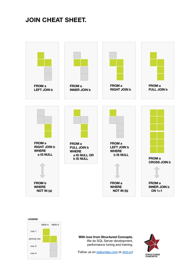
Download and print this nifty little PDF with all of the INNER, LEFT, RIGHT, FULL and CROSS JOINs visualized! It’ll look great on your office wall or cubicle. Your coworkers and your interior decorator will love you for it.

How it works: For each join example, there are two tables, the left and the right table, shown as two columns. For the sake of simplicity, these tables are called “a” and “b” respectively in the code.

You’ll notice that the sheet uses a kind of pseudo-code when it comes to table names and column names.
A visual representation of SQL Server Agent jobs

If all you have is a hammer, everything will eventually start looking like a nail. This is generally known as Maslow’s hammer and refers to the fact that you use the tools you know to solve any problem, regardless if that’s what the problem actually needs. With that said, I frequently need a way to visualize the load distribution of scheduled jobs over a day or week, but I could never be bothered to set up a web server, learn a procedural programming language or build custom visualizations in PowerBI.

So here’s how to do that without leaving Management Studio.